Public relations
Company with customers!
FAIRHUB LOGISTICS CO.,LTD
FAIRHUB LOGISTICS CO.,LTD
 > Public relations > CI Introduction
CI Introduction We will grow into a logistics company who returns customers’ support.
CI Introduction
CI Information

FAIRHUB LOGISTICS CO.,LTD
We will go forward with our customers with a vision of global logistics company.
We will go out with our customers with a vision of a global logistics company.
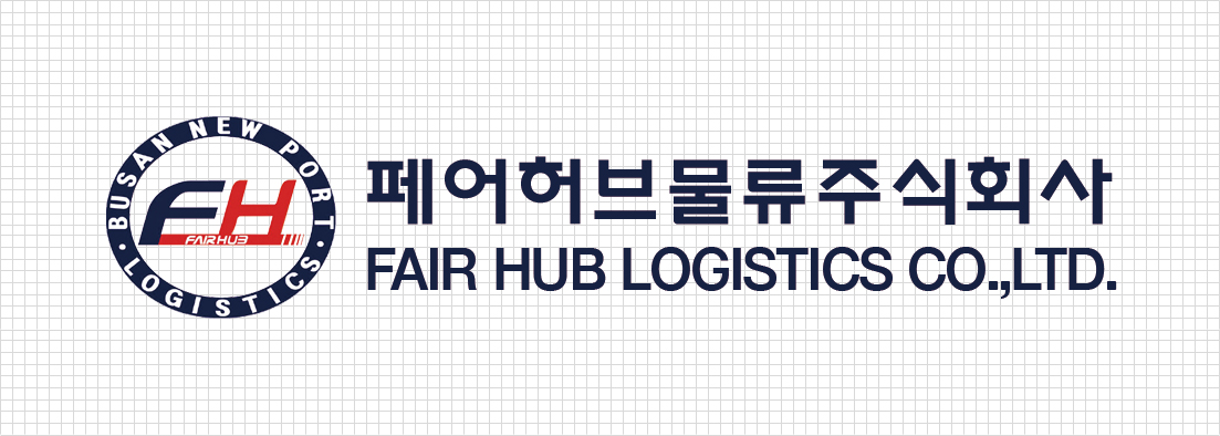
Logo Introduction
The symbol of FairHub Logistics emphasizes on communication efficiency with word marking of English header, differentiation and uniqueness. Blue symbolizes the challenge about the future of Hairhub and the vast ocean, unlimited competition of the world. And the red color is a symbol of passion, future vision and value. In addition, the contrast between the cobalt blue color of BPA and the orange color of the inverted triangle pursues a strong differentiation from that of overseas competition ports.